March 10, 2026
The Future of UI Design in 2026
Why the next wave of interface design will feel less decorative, more adaptive, and much more intentional.
Most interface trend reports confuse surface treatment with actual direction. Rounded corners get swapped for harder ones, glossy gradients disappear for a year, someone announces the return of minimalism, and the cycle repeats. The more useful question is not what styles are fashionable. It is what pressures products are responding to.
In 2026, the strongest UI work is being shaped by density, adaptability, and trust. Screens have to explain more, react faster, and still feel composed. That means the future of interface design is less about louder visuals and more about systems that can scale without becoming noisy.
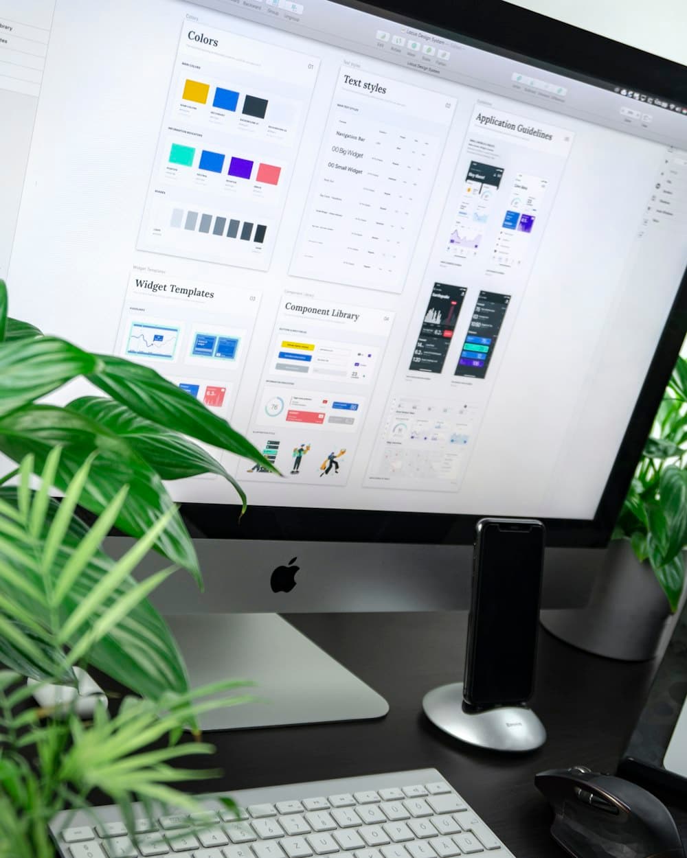
Interfaces are shifting from static layouts to adaptive systems
The old model assumed a page could be carefully composed for one canonical state. That model breaks down once products become personalized, AI-assisted, and highly conditional. Modern interfaces need components that remain coherent while the content, hierarchy, and level of detail change underneath them.
The strongest systems are built around controlled flexibility. They define rhythm, spacing, and semantic importance clearly enough that a screen can absorb change without collapsing into inconsistency. Design systems are becoming less like pattern libraries and more like rules for maintaining visual judgment at scale.
Typography is doing more of the product work
As interfaces get denser, typography has to carry more clarity. Weight, width, spacing, and line length now do the job that decorative chrome used to do. A strong type system can separate primary action, secondary context, and long-form explanation without resorting to constant borders, badges, and background panels.
This is one reason many modern products feel quieter than they did a few years ago. The quietness is not emptiness. It is hierarchy being handled by type instead of ornament. When typography is disciplined, the rest of the screen can afford to step back.
Motion is becoming more editorial and less performative
The best motion work today is not about delight in isolation. It is about helping people track state changes. As products introduce streamed content, progressive disclosure, and AI-generated output, animation becomes a readability tool. Good motion tells the user what changed, where it came from, and what deserves attention next.
That favors slower, more purposeful transitions over constant micro-interactions. Interfaces are learning to move like editing, not like decoration. The result feels more mature and more legible, especially in tools that support longer sessions.
AI is changing the structure of screens, not just their features
Adding an AI button does not change a product category. What changes the product is when the interface starts accommodating uncertainty, iteration, and conversational refinement. That means more products are designing for partial answers, evolving states, and collaborative workflows instead of fixed sequences.
These changes affect layout directly. Screens need space for drafts, side-by-side comparison, reasoning, and interruption. Traditional dashboard patterns are often too rigid for that. The most future-facing UI work is building layouts that can hold generation, review, and action in the same surface without losing composure.
Visual identity still matters, but it has to survive repetition
A brand can no longer rely on one hero moment to carry the whole experience. Most digital products are used repeatedly, across workflows, and under pressure. The design language has to hold up inside data-heavy screens, complex settings, and long-form reading states, not just on the landing page.
That is pushing visual identity toward subtler but more durable decisions: distinctive typography, disciplined spacing, strong contrast behavior, and a clear point of view on interaction. The most memorable products are the ones whose identity still reads after the novelty wears off.
The next standard is composure under complexity
The interfaces that will age best are not the ones chasing novelty hardest. They are the ones that make complexity feel calm. When a product can present dense information, dynamic states, and AI-powered behaviors without feeling brittle or chaotic, it earns trust.
That is the real direction of UI design right now. Not maximalism or minimalism in isolation, but control. Better systems, stronger type, cleaner rhythm, and layouts that remain intelligent as the product around them evolves.
Author
Arjun Bishnoi